When you think of gothic architecture, what comes to mind? Flying buttresses and window tracery? Pinnacles and spires? Chicago’s Tribune Tower and St Patrick’s Cathedral in New York?
Yep, the gothic style has made its stylish mark in the USA, even if the original gothic movement occurred centuries before the first colonizers arrived. It wasn’t until the 19th century – 700 years after the first gothic churches in France – that the so-called ‘gothic revival’ style was born in the States.
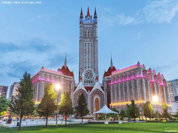
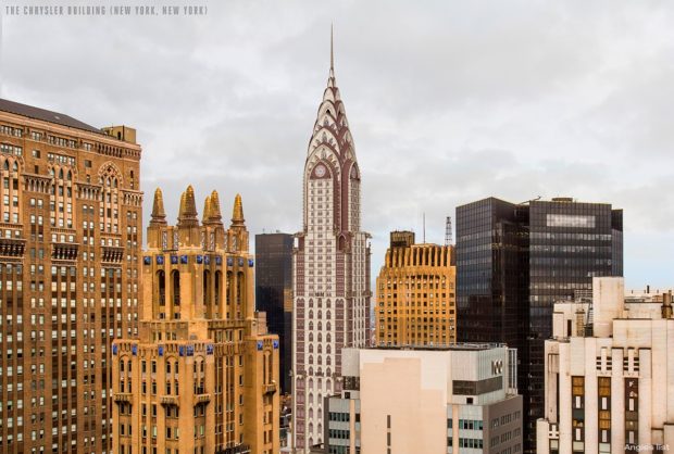
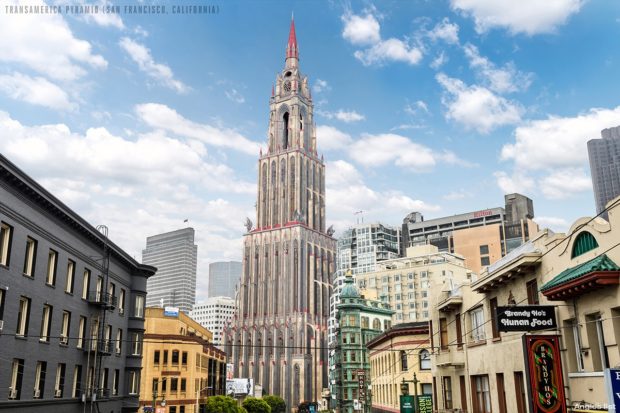
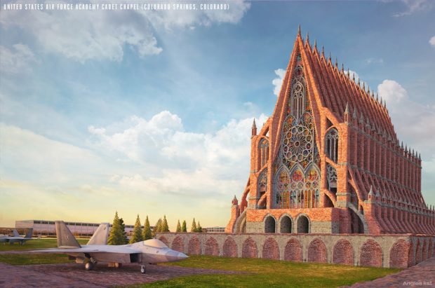
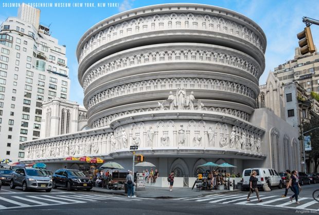
The fashion lasted long into the twentieth century. But it is still somewhat rare among the modernist and art deco-type buildings that flourished as America became rich. So the people at Angie’s List decided to take a look at how some of America’s most iconic buildings might have looked had their architects succumbed to the neo-gothic influence.
They don’t come much more iconic than New York City’s Chrysler Building. Having been built in the 1920s, it’s no surprise that the Chrysler developed in the art deco style. But architect William van Alen did keep one surprise up his sleeve: a 125 foot spire that only went public 90 minutes before the building was unveiled. The spire made the Chrysler the tallest building in the world. So the pomp of its new gothic incarnation feels well-earned.
A somewhat odder building can be found on the far coast: San Francisco’s Transamerica Pyramid. It came much later, in 1972, drawn by architect William Pereira and coming in as Frisco’s second tallest building.
But you’ve got to be tough to survive as a skyscraper in California. Pereira built his stacked pyramids from glass and steel, as was the fashion of the day, fastening the thing to the ground with 16,000 cubic yards of concrete.
His foresight paid off in 1989, when a 6.9-magnitude earthquake shook the city, swaying the Transamerica’s tip from side-to-side by nearly a foot. Probably for the best that Pereira opted for a futurist approach, rather than placing heavy gargoyles up high just waiting to be shaken off!
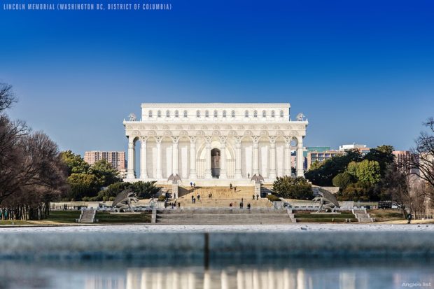
In Washington DC, it is the Lincoln Memorial that gets the gothic revival treatment. Originally drawn up in the Greek Revival style, the Lincoln was in fact a tribute to the union of the American states. It featured materials chosen symbolically from across the US, such as Massachusetts granite and Alabama marble – even if it ended up looking more Parthenon than Pennsylvania Station.
Still, this classical approach means that the designers at Angie’s List already the materials in place for their gothic makeover. The Doric columns that we usually associate with Greek culture are gothicked-up with a cast of gargoyles, while the windows get the clover-shape effect that is so familiar from the great gothic buildings of America and beyond.
Thus the building retains its pomp without losing its dignity at the home of American political life, continuing to honor the 16th president of the United States and leaving its mark on the Reflecting Pool.
What do you think? Would you be more likely to visit these buildings if they’d been built gothic-style from the start?

