There are only a handful of ‘household name’ bridges in the world, and Sydney Harbour is one of them.
In fact, it’s the biggest: the 134-metres-high structure is the world’s highest steel arch bridge. But how did this instantly-recognizable landmark come to look just as it does?
Like many pieces of ‘statement’ architecture, Sydney Harbour Bridge was designed by competition. Beginning in 1900, the Australian government assessed over 70 proposals for the bridge before settling on Dorman Long’s ‘coat hanger.’
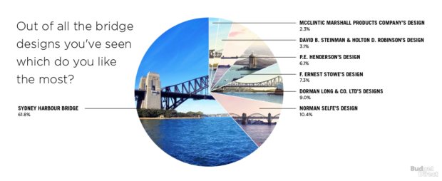
The folks at Budget Direct were curious whether the winning design would stand up today among the runners-up. They ran a survey to see which would be the most popular design for the Sydney Harbour Bridge among ordinary 21st-century Australians.
Read on for the results – complete with images of how Sydney Harbour would look today with the different bridges.
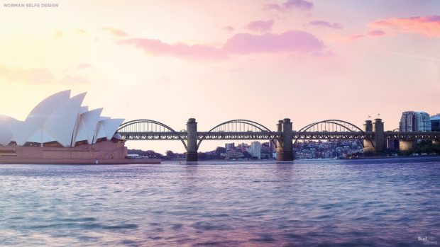
Norman Selfe
Selfe’s 1902 proposal was actually set to go ahead. But the bridge project as a whole was delayed due to a slow economic period and the changeover of the government. There’s something elegant yet playful about Selfe’s looping arches, and you can see why they were popular enough to make it the second-highest voted in the new survey.
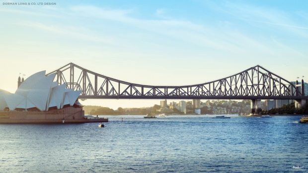
Dorman Long & Co. Ltd
It wasn’t until 1924 that the eventual bridge would finally be chosen. Dorman Long’s company actually proposed seven successive bridges, making structural improvements along the way. The first cantilever bridge pictured would have had a center span of 0.49 km (1,600 feet) set in precast concrete blocks. The second was sturdier, but found to be “aesthetically too severe” – perhaps the judges were already accustomed to Selfe’s prettier suggestion.
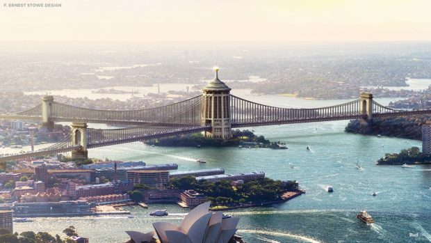
F. Ernest Stowe
Francis Ernest Stowe’s 1922 proposal is one of the more radical designs: a three-way structure connecting Balls Head, Miller’s Point, and Balmain. The central tower on Goat Island would have been a war memorial.
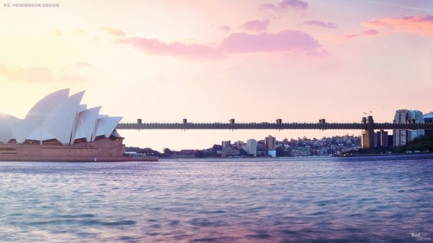
P.E. Henderson
Peter Henderson’s design actually originates from an earlier plan to connect the harbor’s north and south shores. His visually-simple design would have linked Dawes’ Point to Milsom’s Point. Our reconstruction is derived from one of the earliest drawings of a potential bridge over the harbor, although convict-turned-architect Francis Greenway had suggested such a solution as early as 1815.
David B. Steinman & Holton D. Robinson
Robinson & Steinman proposed this bridge contemporaneously with Dorman Long. They combined elements of cantilever and suspension bridge design to a new and very rigid type of bridge. It was dismissed without ceremony by the original judges who said “the bridge would not have a pleasing outline.”
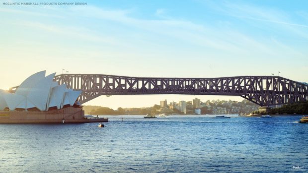
McClintic Marshall Products Company
The McClintic Marshall project was the least popular of the bridges put to a contemporary vote. The company actually submitted several potential designs for the original competition. These included cantilever and suspension bridges and an arch bridge. The one pictured was rejected because it was not expected to “harmonize with its surroundings.” But the company enjoyed success in other regions, playing a part in the construction of the George Washington and Golden Gate Bridges.
Which design gets your vote?

